Unitron's Patient-Centric Design Philosophy & the Creation of Moxi Now
AudiologyOnline: Unitron has just brought home its fourth international product design award in as many years. When did Unitron’s design journey first begin?

Corey Banham: We took our first steps in our design journey about five years ago with Moxi Kiss. At that time, we set out to create a new design language that was consistent and reflective of our brand. It was really at that point about creating an aesthetically pleasing hearing instrument — something people would want to wear and hearing healthcare providers would be proud to represent. And we did that. Moxi Kiss performed very well in the market, and won us our first RedDot product design award in 2014, then an iF award the same year, followed by two subsequent RedDot awards for Moxi Fit and Stride™ P.
AudiologyOnline: How has that design strategy evolved over the last five years?
Corey: We have come to recognize it is not just about creating a good-looking hearing instrument. It is about a patient-centric design philosophy that addresses the entire experience. Aesthetics are important of course; a small, beautiful hearing instrument that looks good in the hand and on the ear. However, we want to create great products that move with a patient from first impression to lasting impression. So, comfort and function are equally important design considerations. Some competitive products, for instance, look small in the hand but because of the lines, actually look huge on the ear. Others have sharp edges that create pressure points and become uncomfortable over time.
AudiologyOnline: Are there specific design influences you can speak to?
Corey: Well, in the early days with Moxi Kiss, we studied and drew influence from other leading brands known for product design; for instance, the hearing instrument’s microphone ports echoed the air intakes of a Porsche. However, as our design philosophy matured, we turned to a Design Thinking model, which is a human-centered approach to innovation that many design-focused companies leverage. It puts the user (in this case the patient) at the core of our development process to structure all creative processes. This helps us understand the feelings and needs of people with hearing loss, define the most important areas for innovation, create multiple solutions to address those areas, and test and evolve the best of those solutions to provide people with the best wearing experience. It also ensures that we don’t randomly create solutions that we think could be good ideas but actually might end up providing pain points to wearers.

AudiologyOnline: What kinds of insights did you discover along the way?
Corey: We know from third party research that the size of the hearing aid is important to patients. However, the structured Design Thinking process helped us to understand how people felt about wearing hearing instruments, and the pain points that they find with them. For instance, they found that they weren’t discrete enough, are sometimes uncomfortable, and the controls are sometimes difficult to find and use. This is what has driven our patient-centric design philosophy – to focus on those three areas to create the most enjoyable and seamless wearing experience. Our intent is always to create hearing instruments that don’t end up getting tucked away in a drawer. They should be comfortable so people want to wear them all day. A great experience with hearing aids is what allows people to overcome hearing loss and reconnect with their lives.
AudiologyOnline: How does all this learning translate into the creation of Moxi Now?
Corey: Well first, we set a goal to create the smallest wireless RIC on the market. We didn’t want to have a ‘me too’ offering, but rather, something small and really special. It’s actually been a three-year creation process and about two years ago we hit a turning point, and could finally, with all our learning around various form factors achieve the smallest. Our team of seven mechanical engineers, all worked on different parts of the hearing instrument. Our mechanical engineering team in Canada thinks holistically from the very beginning about how the electronics need to fit in to support our design language, and how the shell parts need to interlock to provide a robust structure, while taking as much of the air and plastic out of the inside as possible.
We’ve gotten very good at this thanks to our lead mechanical engineer, Edison Lee, who brought his expertise from the aerospace industry, where making very strong structures with very light and minimal material is a necessity. One group looks after the G2 curvature surfacing, which gives the appearance that the instrument has been carved from a single piece. Another group worked on internal components and locking mechanism and electronics. Yet another worked with our third party tooling vendor to take Moxi Now to the highest tolerances. Audiologists are also an integral part of the design team, to help with testing with patients. In the beginning, using one to one scale models painted to look like real hearing instruments, they had people rate them for comfort and compare them with other models on the market. They were looking to draw out their perceptions of comfort when worn on the ear and for aesthetics.
AudiologyOnline: So how does Moxi Now pull the whole design experience together?
Corey: It’s not just about creating the world’s smallest hearing instrument; it is about addressing the entirety of patient need. Aesthetics, comfort and intuitive functionality must work together. When we put the patient at the center of the innovation process, we focus our efforts on creating the very best experience for hearing instrument wearers. The kind of design reaction we have been striving for is to have people say, “Wow these are not my grandparent’s hearing aids!” Our designs are truly changing people’s perceptions.

AudiologyOnline: And how does a small, very well designed hearing instrument help the hearing healthcare professional at the end of the day?
Corey: It absolutely makes the healthcare professional’s job easier. As the world’s smallest wireless RIC, Moxi Now becomes an attractive marketing opportunity. We believe clinics will be actively using Moxi Now to draw people into the office to try hearing aids for the first time. It looks like something people want to wear, and when they try the hearing aids on, the hearing instruments tick all the boxes of discretion, comfort and ease of use. The goal is that the technology should be as seamless and transparent as possible to promote easy acceptance. Combined with a great in-clinic patient experience, this adds up to happier patients. And happier patients are far more likely to become advocates and that means more referrals to the clinic.
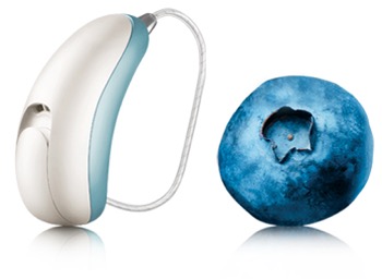
Moxi Now is a beautifully designed hearing instrument that is only 22 millimeters (.866”) tall, 14% smaller than the company’s closest competitor, and 39% smaller than its sister product, the award-winning Moxi Kiss – check out more details https://www.moxinowwow.com/, at our website, www.unitron.com, or at the Unitron Expo Page on AudiologyOnline.


